March 8, 2016
Our team had the pleasure of going to a seminar by Getty Images talking about the visual trends for 2016. The event took place at their new exhibition offices in London, and it was organized by the lovely folks at The Drum Network (shout-out to Naomi for inviting us!).
It was an hour of ‘wows’, ‘heeeeeell yes!’ and ‘this is handy’, and we left with our brains buzzing. Here’s an extra tip for you: if you ever want to boost your creativity, go to a good seminar. It will give you a new perspective.
But moving on!
To prevent information overload, here is our take on the top three visual trends for 2016 by Getty:
Outsider In
This trends resonates with the rebel in us and embraces the weird and unique in each of us. It’s driven by strong shifts in our society towards self-expression and going against the ‘status quo’, and Miley Cyrus & Amy Schumer are its queens. You can see references of this trend in politics (Trump…yeah, he knows what’s up), movies (Mocking Jay, Star Wars etc.), and the new generation Z that strives for making the world a better place.
How does this reflect visually?
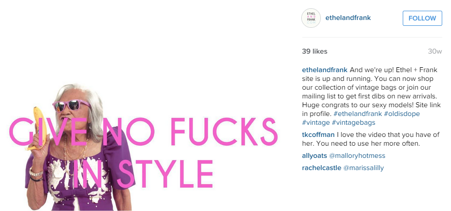
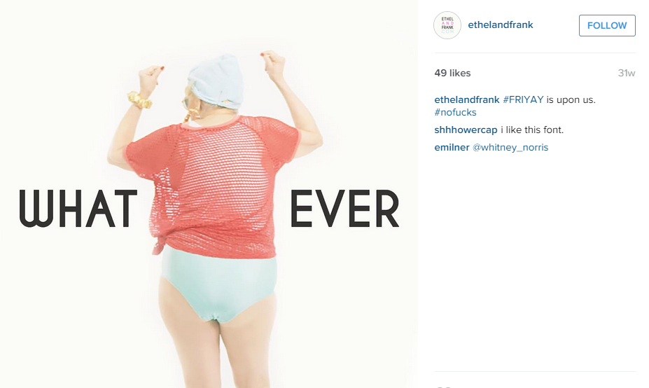
Images illustrating the ‘out of ordinary’ people – think braces, crazy hair, freckles and (would you believe it) OLD people that would normally never ever make it on the covers of flashy magazines. This is basically the Ethel And Frank campaign in a nutshell…just look at how awesome this is:
But it doesn’t end there, ladies and gentlemen, oh no. It’s also about people’s weird little habits and personality traits. All people have them like one of our colleagues likes to sing in the shower (what a maverick!) In the world of brands, this is our favorite representation of the trend:
https://www.youtube.com/watch?v=lZR0O_xqVpg
So next time you are trying to create a unique campaign, channel your inner weirdo and ask yourself: Would people I’m talking to relate to this? Is the empowerment message in showing that world is full of amazing people that coming in all kinds of shapes, sizes AND brainwaves? Maybe it is.
Divine Living
Next up: the need to connect to who we are, what’s our purpose and trying to figure out what is the sense of all of this. Not to get too philosophical but this trend actually is quite…well…divine (we challenge you not to hear a choir singing every time we say that word). To get a better idea of it, let’s look where most teenagers do: the pop culture. A minor and aspiring artist, I believe his name was Justin Bieber, released a new CD aptly titled PURPOSE asking not only himself but also his devoted Beliebers to look for their purpose in life. The goddess of pretty much everything, Oprah, launched her TV series called Belief exploring the religions and cultures around the world to show how connected we are.
Oprah's Belief Story #25 What is Love? #beliefstorieshttps://t.co/YI2Udb4hOd
— Oprah Winfrey (@Oprah) October 15, 2015
We know what you are thinking: This is all warm and fuzzy but how should we use that for our campaigns?
In a more literal way, more brands try to focus on the big questions that matter to people and connect with them as human beings – in other words. less focus on products, more focus on ‘issues’ and feelings. This trend also uses a lot of soft lighting and colors – Pantone has nominated the new-agey “Serenity” and “Rose Quartz” as Colors of the Year as another harbinger of “Diving Living.”
NEWS: Annie Leibovitz shoots new UBS campaign of entrepreneur portraits > http://t.co/fDRfjfZ7By pic.twitter.com/W23iSR8r8N
— It's Nice That (@itsnicethat) September 2, 2015
https://www.youtube.com/watch?v=U4Ur7kDn6lU
Something that we loved was the God’s Eye View. We already use this for some of our clients so it was great to get the nod of approval from Getty, This visual technique looks at the world (or anything else) from the above showing us how small we are in comparison to everything and how we fit into the ‘world puzzle’. But it doesn’t have to be just images of city networks, table tops work too! Another thumbs up for this visual style is that it works great on mobile – and we are all about that mobile, that mobile, no tre…ehm! Double win!
Are you a foodie fan? You could win @wagamama_uk for a whole year!* https://t.co/dVXhxCEpH0 pic.twitter.com/2T8cj8QJqQ
— Westfield Stratford City (@westfieldstrat) January 28, 2016
All work and all play #Oreo pic.twitter.com/tqe41aHzyX
— OREO Cookie (@Oreo) October 20, 2015
Silence Vs. Noise
Last one but a good one.
This one is a bit linked to the Divine Living trend in the sense that it touches upon our need to disconnect from the tech, connect to our emotions and just…be.
Why is it a different trend, you ask?
Simply because it’s visually represented a tiny bit differently than the Divine Trend (choir singing).
This trend plays with a fine balance between empty space and a carefully chosen focus point. Its colours are kept to minimum – usually playing with high contrast (white background with a red element).
We updated an old ad campaign to celebrate the launch of the @VW Beetle Convertible, take a look: pic.twitter.com/1j8eTvhA
— Volkswagen (@VW) December 19, 2012
Power out? No problem. pic.twitter.com/dnQ7pOgC
— OREO Cookie (@Oreo) February 4, 2013
Kitkat did an amazing campaign in the spirit of Silence vs. Noise giving people a break from the ads with an ad (yes, we get the irony):
Common themes
Looking at those trends with a God’s Eye perspective (pun intended) we can see the famous red thread connecting them all: society’s need to connect with who they truly are and disconnect from the artificial, noisy and irrelevant.
Our recommendation (without sounding too vague)? Hang on that red thread, let it guide you when making not only visuals, but also the content for your campaign – de-tangle from spraying your customers with promotions you want to get out but they are not really that interested about. Less about your product, more about issues people might face.
The beauty is in quality, not quantity, and the fact that you have 100k reach and 10k likes on your latest post doesn’t mean you also have more than 1k people genuinely interested in what you are saying.