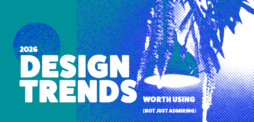
January 27, 2026
Feeds are getting tired of “perfect”. A lot of the most interesting work going into 2026 is reacting against hyper-digital polish with visuals that feel more handled: scanned textures, mismatched elements, collecting layouts, and deliberate “imperfections” that make the human hand visible again. That matters for social, because audiences clock templated an AI content fast, and anything that looks too frictionless can read as less trustworthy or less culturally connected.
1. The lo-fi, “warning low ink” aesthetic, but made for screens
People fancy images that look like they’ve been through an office machine: low-ink coverage, grain, dust, and soft distortions. The point isn’t nostalgia for its own sake; it’s a look that instantly signals DIY energy and a pushback against overly smooth digital production.
On social, this is gold for campaigns where you want personality and immediacy: creator partnerships, community updates, limited drops, music/arts clients, or any brand trying to feel less corporate. If you animate it, it becomes even more native to Reels and Stories without turning into visual mud.
2. “The visual index”: collecting as a layout format, perfect for carousels
Another trend that translates almost directly into social media marketing is laying assets out in one run, cut-and-paste inventories of eclectic shapes and objects, like curated collections. It frames content as something you’re cataloguing and sharing rather than broadcasting.
This format is basically built for carousel education and product storytelling: “what you get”, “what’s inside”, “the steps”, “the toolkit”, “the menu”. It also encourages the kind of lingering behaviour platforms reward, people pause to inspect, swipe to see “the rest of the set”, and save it because it feels reference-like. The best executions keep a consistent system (grid logic, numbering, labels) so the collection feels intentional rather than cluttered.
3. Micrographics and technical overlays, credibility as a visual style
Micrographics, the “aesthetics of technical information”,are being pulled from the background into the foreground: tight typographic overlays, grids, timestamps, symbols, diagram energy.
For social marketing, micrographics are especially strong when a brand needs to look serious without becoming boring: B2B, sport/fitness, education, fintech, product-led brands, or any client selling expertise. They work because they imply depth, treat micro-details as navigation (helping the viewer understand what they’re looking at) rather than decoration.
4. Pick-and-mix typography, patchwork type for short, and loud hooks
Collaged letter sets and mismatched characters are a direct reaction against the idea that everything must be perfectly consistent to be “good”. This is extremely usable on social, with one big caveat: keep it for short hooks. Two to six words on a Story, a Reel cover, or the first carousel slide can stop the scroll immediately. Then hand off to a calmer supporting typeface for body copy, captions baked into the edit, and CTAs. However, be cautious, as when brands attempt to implement this style across paragraphs, accessibility and clarity often take a hit.
How to apply these trends without harming performance
The common thread across all those trends is that they’re systems for making content feel more human: through texture, collection, detail, and expressive type. A useful rule in practice is: choose one hero trend per asset, then support it with a clean hierarchy (headline, proof, CTA). Get in touch with us to get the cultural “2026” flavour without sacrificing readability, conversion, or brand consistency.