February 6, 2025
Ah, the retro aesthetic. It’s like finding an old vinyl record in your attic – instantly nostalgic, undeniably cool, and somehow still relevant. In the world of social media design, retro aesthetics have made a triumphant comeback, and honestly, we’re here for it. Whether it’s the neon glow of the ‘80s, the grunge vibes of the ‘90s, or the pixelated charm of early 2000s tech, retro design is everywhere. And why not? It’s fun, it’s bold, and it’s a brilliant way to stand out in a sea of minimalist, sans-serif monotony.
So, grab your scrunchies and dust off your Tamagotchis (maybe this time I’ll remember to feed it… 😅) – we’re diving into the world of retro aesthetics in social media design.
Why Retro? Because Nostalgia Sells
Let’s face it: nostalgia is a powerful emotion. It’s like a warm hug from your childhood, and brands are using it to their advantage. By tapping into retro aesthetics, they’re not just selling a product – they’re selling a feeling. Whether it’s the comforting familiarity of a ‘70s colour palette or the rebellious energy of ‘90s graffiti, retro design evokes emotions that modern aesthetics often can’t.
And for creatives, retro design is just fun. It’s playful, it’s unexpected, and it’s a breath of fresh air in the often-serious world of social media.
Key Elements of Retro Aesthetics
Before we get to the examples, let’s break down what makes retro design, well, retro:
- Colour Palettes: Think bold and vibrant (hello, ‘80s neon) or muted and earthy (‘70s vibes). Retro colours are rarely subtle.
- Typography: Chunky serifs, groovy scripts, and pixelated fonts are all staples of retro design.
- Textures and Patterns: Grainy textures, checkerboards, and geometric patterns are your go-tos.
- Imagery: Polaroid-style frames, VHS glitches, and cartoonish illustrations all scream retro.
- Icons and Symbols: Think cassette tapes, boomboxes, and old-school gaming consoles.
Retro Aesthetics in Social Media
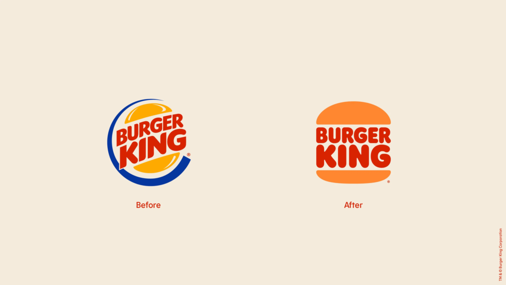
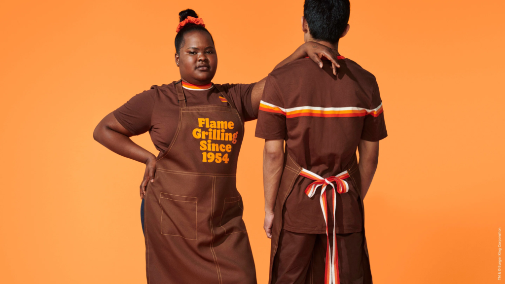
Burger King’s ‘70s Rebrand
In 2021, Burger King said “out with the new, in with the old” and unveiled a rebrand inspired by its 1970s logo. The result? A mouth-watering mix of warm browns, oranges, and yellows, paired with a chunky, retro font. Their social media posts embraced this aesthetic wholeheartedly, with grainy textures and playful illustrations that felt like a trip back in time. It’s a perfect example of how retro design can feel fresh and modern while still paying homage to the past.

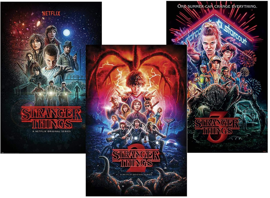
Netflix’s Stranger Things Marketing
When it comes to retro aesthetics, Stranger Things is the undisputed king. Netflix’s social media campaigns for the show are a love letter to the ‘80s, complete with neon lights, synthwave fonts, and VHS-style effects. It’s immersive, it’s nostalgic, and it’s downright brilliant.
How to: Retro Aesthetics in Your Social Media Design
Fancy giving retro design a go? Here are a few tips to get you started:
- Pick Your Era: Decide which decade you want to channel. Each has its own distinct vibe, so choose one that aligns with your brand.
- Don’t Overdo It: Retro design is bold, but that doesn’t mean it has to be overwhelming. Balance is key.
- Mix Old and New: Combine retro elements with modern design techniques for a fresh take on nostalgia.
- Have Fun: Retro design is all about playfulness, so don’t be afraid to experiment and get creative.
Retro aesthetics are more than just a trend – they’re a celebration of the past, reimagined for the present. Whether you’re a brand looking to connect with your audience on a deeper level or just someone who loves a good throwback, retro design is a fantastic way to make your social media stand out and make your audience feel something.
So, what are you waiting for? Grab your gel pens and Lisa Frank notebook, and start creating!
Now, if you’ll excuse me, I’m going to go dust off my Walkman.
If you love retro vibes and nostalgia as much as we do, then why not give us a shout!