November 14, 2019
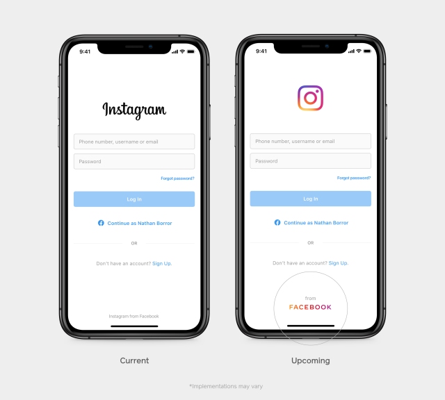
As a consumer, you’d be forgiven for missing the change in product branding which occurred this week by Facebook. Sorry, FACEBOOK.
Their announcements around the rebrand focus on their objective to be “clear” about which products belong in their wheelhouse. This effort may seem little more than a PR move – as The Guardian reports, “sure, Facebook has its problems. But FACEBOOK is doing just fine.”
So, what’s changed?
The main Facebook website app will continue to hold the original blue colours, and the other products owned by Facebook will begin to carry a new-look logo.

Hang on, what other products?
If you’re not sure just which products are owned and run by Facebook, here’s a little list:
Is this really a rebrand?
Well, we don’t think so. It appears to be a subtle way to distance the product portfolio from the website & app, while at the same time putting up a united front and connecting the brands. Usually, when a global brand shares a new brand vision, it’s more than just a logo – one might assume the brand had spent time consulting with its employees and customers on their perceptions of the company, how they can best represent their values visually and open up to share their vision for the future of the brand.
It’s fair to say the announcements have not really raised many eyebrows, and as in the opening paragraph, did any of the consumers really notice? Oh, but wait, perhaps FACEBOOK is simply relying on the well-known use of internet language – the name is in ALL CAPS, therefore the announcement is obviously LOUD!