May 2, 2014
You may or may not have read countless articles, suspiciously pointing the finger at Twitter’s re-design and how it closely matches the appearance of another popular social network. Or you’ve logged into your account and have been taken aback by an enormous cover photo. Yes Twitter has had an image overhaul, so pay attention as we take a look how brands can take full advantage of their shiny new Twitter page:
Stand out and be noticed:
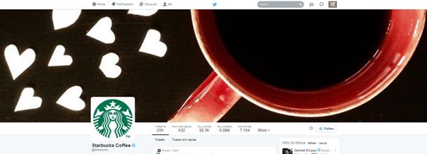
One obvious change users will notice is the large cover photo, which sits at the top of the profile page, much like Facebook’s cover photo.
Carefully consider your cover photo, as this vast space is where you can make a powerful impression to draw users to your timeline. The image should be 1500 x 500 pixels, visually engaging, clearly depicting your brand messaging, making you stand out amongst your competitors.
Twitter designer David Bellona shared his thoughts on the company’s blog page, announcing that the profile layout “will be easier (and, we think, more fun) to express yourself through a new and improved web profile.”
This is what Starbucks did:
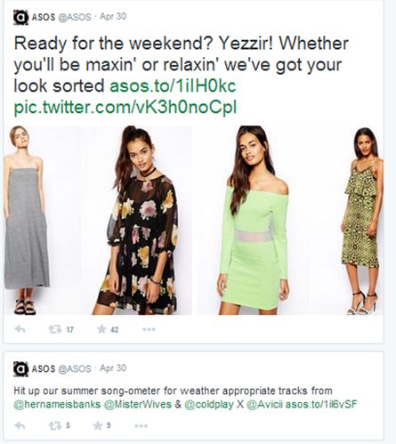
Timeline tweets will change too
The most engaged tweets will appear emphasised and larger on your page, making it easier for followers to spot your “best tweets” – this is perfectly illustrated on the Twitter page for ASOS:
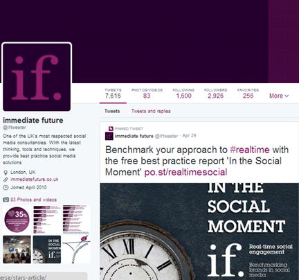
Another feature, the “Pinned Tweet” will allow you to pin a tweet to the top of your page so that it stands out from the rest. But what can brands do with this feature? If you’re launching a campaign, why not share your message with a tweet and pin it, to make sure it’s the first post users read. See how we’ve put the “pinned tweet” into practice:
There’s just one catch
It’s important to mention the new design will only be visible to desktop users. But why does that matter? Well an astonishing 75 percent of Twitter’s active users access the platform via mobile… and there are no (announced) plans in the pipeline to roll out the revamp to mobile. Whilst brands should absolutely take advantage of the benefits a mini-makeover will bring, it’s important to consider which channels your audience interacts and is engaged with, to optimise visual content accordingly.
If the majority of Twitter traffic comes from mobile, why only limit the re-design to desktop? One argument is that the image overhaul may attract and hook-in brands turning away from Facebook, disgruntled by the platform’s dwindling organic reach potential. Whilst the conspiracy theorists amongst us may take the update as another step in Twitter’s attempts to monetise from the platform, it cannot be refuted that the design is slick, easier to navigate and much more appealing to brands wanting to maximise the power of visual marketing in their content strategy.