June 20, 2022
So, your post text is ready to go – you’ve got the hashtags all set up, all the companies and people that need tagging are included… just the easy thing to sort now: the visual. Beware the pitfalls here!
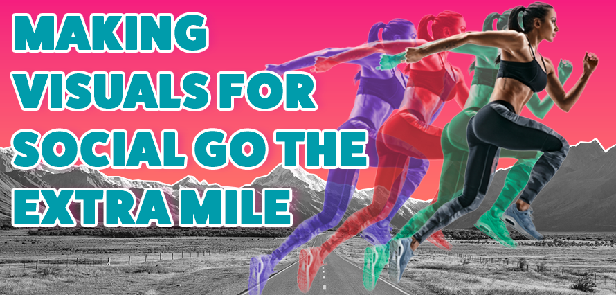
It’s probably the easiest thing to get right and get wrong. Remember the golden rule – no one is scrolling down their feed looking for you – it’s up to you to get their attention and make thumb-stopping social media content. The first thing a user will tend to notice is the visual – so maximise its visibility and get the message across early.
Here are some suggestions for how to make an image, video or animation stand out.
- If it’s a video, make the intro short and clear – who is speaking, what companies are involved? Don’t make it too long! If someone sees the video is 10 mins in length, they won’t be hanging around to watch all of it.
- If it’s an animation, do the first few seconds give an indication as to what it’s about? Don’t get too wrapped up in swirling graphics and fancy fade-ins – make it count early on.
- If it’s a static image, do the colours work with the platform’s background? How much text is on the image? Is the resolution suitable for social? Think mobile, but don’t forget desktop!
Brand guidelines are of course important to consider, but being completely married to these can limit you. Consistent messaging and brand promotion form strong foundations for marketing success, but don’t be afraid to experiment a little. ‘Post fatigue’ is a real thing – if someone scrolls through your feed and sees the same formatted graphic with logos, text and imagery over and over again, it can be disengaging.
If you need advice on social media campaigns and want to know how to create social media that is thumb-stoppingly good – contact us today.