February 20, 2023
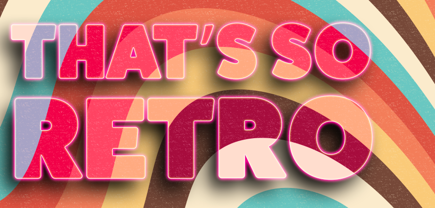
Who doesn’t love a bit of retro nostalgia? Especially when it comes to design. There’s just something about those textured images, colours and fonts that really play to our nostalgic brains – even if we weren’t alive for those specific time periods.
We’ve all been obsessed with retro and vintage however, Gen Z has been seriously kicking it up a notch – 90’s aesthetic is back (and I’m living for it… minus the low rise jeans, those can stay in the 90’s/00’s!)
But why does it work? What could be an incredibly boring image, instantly get’s a face lift when, say, flash photography is used. Or when an illustration uses elements of 1920’s rubber hose animation.
This leads me on to my blog for today, I thought it’d be interesting to take a look at some brands that have embraced the “retro rebrand”, either for their own branding or for a specific campaign.
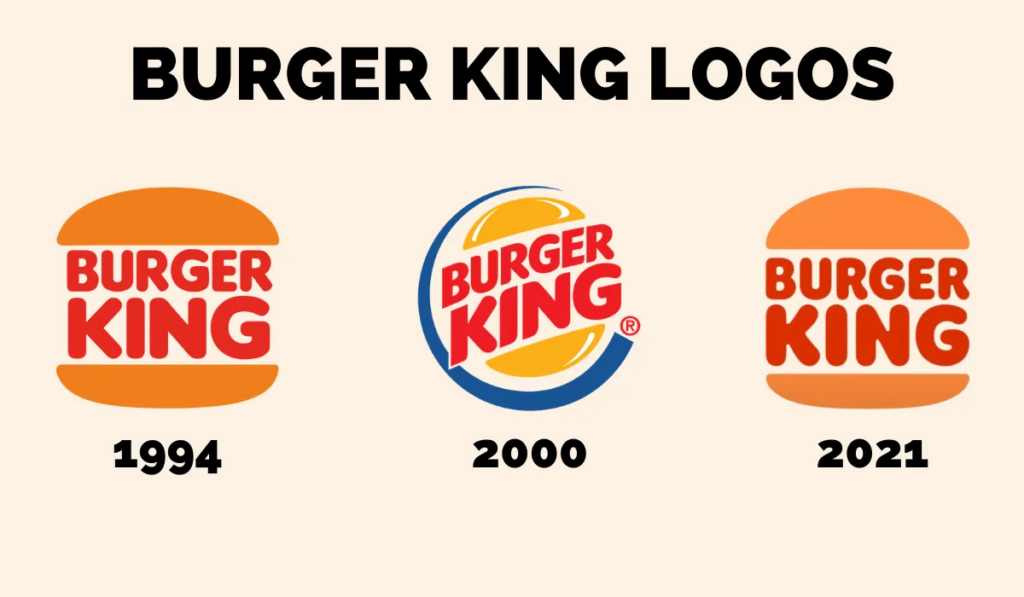
The first brand that comes to mind is Burger King;
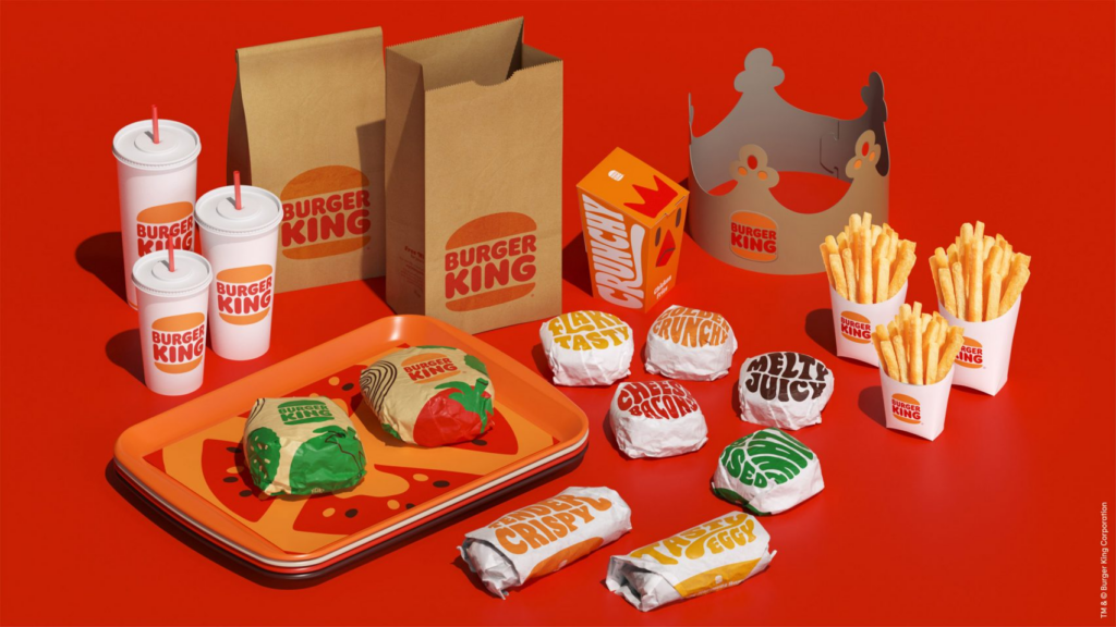
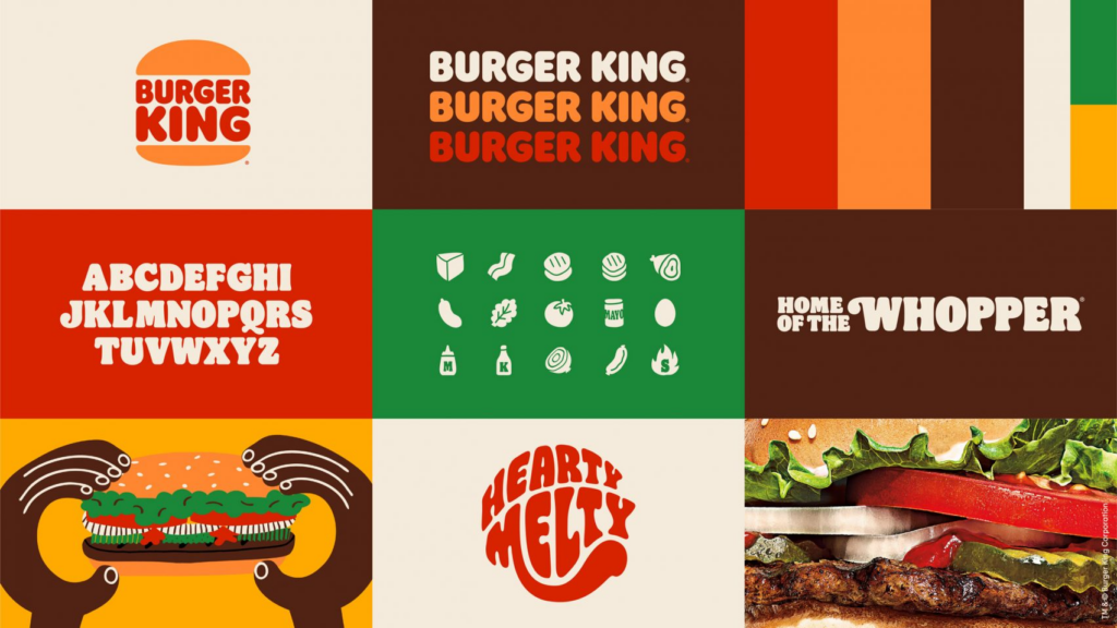
Taking elements from their 90’s branding and giving it an update, it’s still retro yet modern. A far cry from their previous design which screams 2000’s.
“An irreverently bold typeface, Flame Sans evokes the natural, organic shapes of food,” said Jones Knowles Ritchie.
“Warmer colours bring vibrant, fresh ingredients and the brand’s trademark flame-grilling method to life in packaging, crew uniforms, and digital experiences.”
Next up we take a look at GoDaddy and their .TV domain
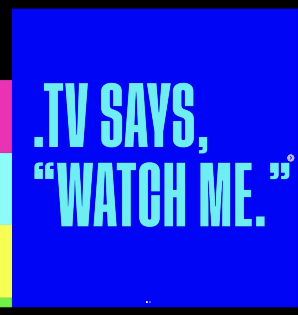
GoDaddy combined nostalgia with the new, it’s still sleek, modern and fresh but hints to those earlier days of TV. I dont know about you, but I’m 100% getting Teletext vibes when I look at their visuals.
“We wanted to evolve the .TV brand into how consumers think of it today: streaming, content creation, gaming, animation and other forms of emerging media,” said Chris Rushing, brand creative director at GoDaddy. “By blending a retro look with edgy, modern aesthetics, it helps attract audiences old and new while using a brand voice that can relate to anyone. This was one of our most exciting projects of the year.”
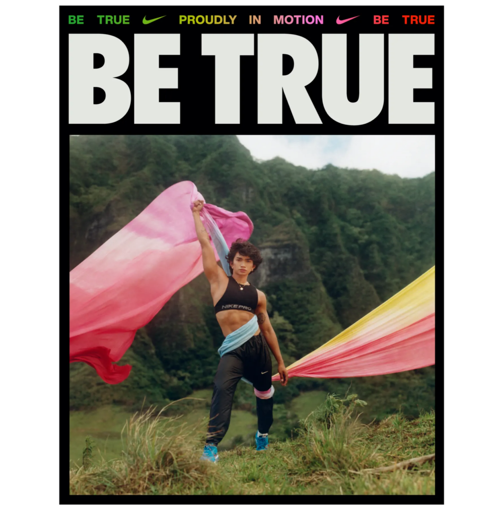
And lastly, a company that always gets their branding and campaigns *so* right, Nike.
For their BeTrue 2022 campaign Nike dipped their toe into the world of 80’s trends within design and photography which produced some beautiful imagery along with powerful messaging.
Retro rebranding has a way of evoking warm memories for their consumers, you can’t help but smile and in the world of social media where everyone is screaming for you attention, it’s truly Thumbstopping work.
So, will you be giving retro rebranding a try? Keep those peepers peeled, I hear the IF designers have something cooking 👀