June 22, 2017
I guess it’s been a long time coming, but Twitter has had a bit of a facelift. Its latest update, rolling out to iOS, Android and web users, is mostly cosmetic and cuts out the clutter of the old interface. The redesign comes after Twitter’s struggle to attract new users at the same pace as Facebook, Instagram and Snapchat.
“I think the design team felt like it was the right moment, because we finally had a clear idea of what we’re doing,” says Grace Kim, head of user research and design at Twitter. Years of research, surveys and testing revealed one and the same thing: people found Twitter too complicated. The team knew that tweets must be front and centre. Everything else was negotiable.
Square avatars are now circles, which should help distinguish users from tweets. What used to be solid grey icons are now minimal outline drawings. Headers are now bold, making it easier to navigate. The home icon is still a birdhouse, but now has just one hole instead of two.
One of the most exciting new features is the real-time update of Retweet, Reply and Like counters. Now you can sit back, relax and watch your tweet go viral! Sweet!
The reply button is swapped with a speech bubble that Twitter hopes is clearer in its purpose.
The profile tab, that used to be at the bottom of the interface, has now upgraded to a side navigation menu. This was introduced to Android last year but will be a first for iOS Twitter users. The sidebar will have the profile, additional accounts, settings and privacy all in one place.
While many like the new minimalistic look, others don’t seem quite as keen. There’s been around 30,000 tweets within hours of the change, under the #NewTwitter hashtag expressing their dislike to the new-look timeline. Some claim the circular icons are visually unappealing, as well as restrictive for profiles using text and logos in their avatars.
Other unhappy users weren’t as bothered about the appearance, but rather criticized Twitter for ignoring technical complaints against the platform, such as issues with loading GIF and videos on certain devices, better ways of combatting trolling and harassment, and the fact that we STILL can’t edit a tweet.
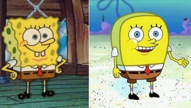
While I’m totally happy with the clean look, my favourite outcome of the #NewTwitter debate has to be this SpongeBob SquarePants image: