December 12, 2018
It’s that time again when everyone looks back on the year to remind themselves of all the work they’ve done and look at what performed really well, what shocked people, what didn’t quite work out as initially thought, etc… It’s a time of reflection but it’s also a chance to be a bit of a psychic. Seeing what did really well helps us predict trends for the future. With social content it’s important that if using visuals they have to stand out. And as there’s trends in fashion, there’s also trends in art and design. Keeping on top of what’s hot and what’s not when it comes to visuals can really help you out when designing for social.
One company that looked back on 2018 to predict what’s going to prove popular in the year ahead is Shutterstock, the online marketplace for stock imagery.
“Color is a universal communicator, a dynamic force of the visual world that brings life and meaning to everything we see. It affects how we feel, too. Humans have instinctive, emotional, and cultural reactions to colors across the spectrum.”
Shutterstock is all colours. From black and white photography to vivid vector illustrations, everything is colour. By using search data, they looked at what hues its users downloaded most over the past year and by analysing all the pixels and hex codes, they created a pretty good picture of the colours we just can’t get enough of. Drumroll please…
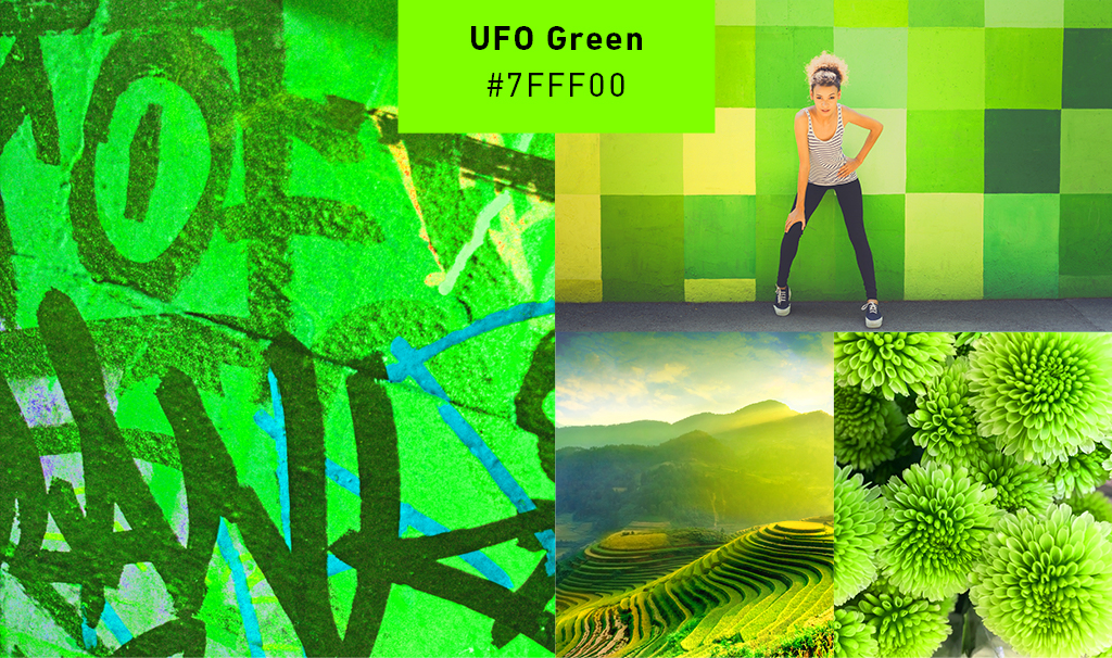
UFO Green
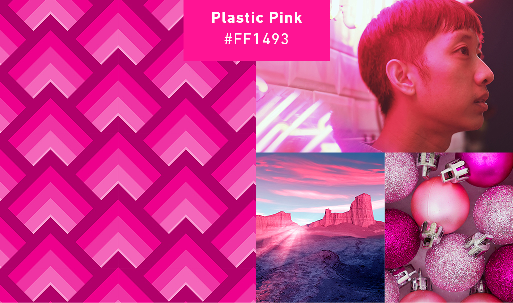
Plastic Pink
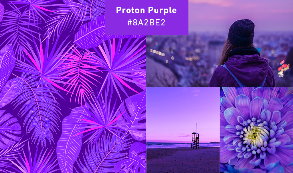
Proton Purple
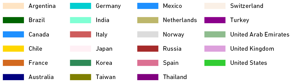
Local Favourites
While the three colours above are the universal top picks, Shutterstock also broke down colour trends by country. In the chart below you can see which colours are most popular in certain countries.
The colours we love at any given time reflect more than just the latest fads in fashion and design. In the 50s it was all about pastels, they gave people a sense of calm after a long time of war. In the 70s it was all about earthy tones that perfectly reflected the growing conservationist movement. If we look at the main influence in today’s culture, it has to be technology, and these energetic colours really seem to pack a sci-fi punch. Shocked at the bright spectrum of these? Not sure they really fit with your brand? Go ahead and do an A/B test with your next campaign’s visual assets and see if there’s any difference in engagement. What’s the worst that can happen? 🙂