March 19, 2026
Browsing through Pinterest, your camera roll, or that chaos of open tabs, you probably ended up saving something (or a bunch of things) “for later.” A colour combo. A logo. A layout that just felt right. In our previous blog, Chill, You’re Still Creative: How To Keep The Ideas Flowing, we talked about feeding your creativity so those moments keep happening. Now we’re going a step further: this is where all those scraps start turning into a clear visual identity you can actually brief, design, and ship.
Why moodboards are more than pretty collages
Moodboards get dismissed as the fluffy bit before the “real work.” In reality, they’re the cheapest, fastest way to make sure everyone’s talking about the same idea before you burn hours in Figma or Premiere. A moodboard is simply a curated collection of images, colours, type, textures, and references that capture the feel of a project before you decide the exact form.
For brands and campaigns, they act as your visual North Star: a single place that says “this is the world we’re operating in.” Get that right, and every choice that follows, logo, feed layout, story templates, ad creative, becomes about refinement, not guesswork.
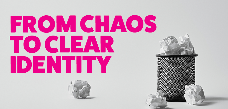
Step 1: Turn chaos into a focused moodboard
If you followed the last blog, you’re already saving a daily “scrapbook” of 3–5 things that caught your eye. Now you’re going to use all of that, but with intent.
A simple way to build a working moodboard:
- Start with a direction, not a design.
Pick a loose phrase like “soft pastels, friendly type” or “bold, high‑contrast newsy” and let that be your filter for what makes it onto the board. - Shop your own archive first.
Go back through your screenshots, bookmarks, Pinterest, or Notion and drag in anything that matches the direction. Don’t worry about perfection; just collect. - Curate ruthlessly.
From that big pile, narrow down to 10–15 images that genuinely earn their place. Aim for a mix: colour examples, type, photography, layout, maybe one or two examples from totally different industries to keep it fresh. - Add a few words.
Under or next to each cluster, add 2–3 words that capture why it’s there: “approachable, human, generous whitespace” or “punchy, opinionated, headline‑first.” Those words will become gold when you’re presenting to stakeholders later.
By the end of this, you should have something that looks less like “stuff I liked” and a more cohesive “this is the world this brand lives in.”
Step 2: Bridge moodboards into visual identity
Moodboards are where you “try on” different outfits for your brand personality. Visual identity is the decision about what you’ll wear every day.
Once a moodboard feels right, start translating it into tangible choices:
- Colour palette
Pull 3–5 core colours from your board, plus a couple of neutrals. Check you have enough contrast for accessibility and enough flexibility for social templates, stories, and dark mode. Coolors has a fantastic contrast checker tool. - Typography
Look at the type on your board. Is it loud or quiet? Rounded or sharp? Choose 1–2 typefaces that echo that mood, then test them on real use cases: a post headline, a thumbnail, a newsletter subject line. - Imagery style
Decide what “on‑brand” photography or illustration actually means: candid vs staged, grainy vs clean, muted vs saturated. Drop a few test images into mocked‑up posts and landing pages to see if the vibe holds together. - Graphic devices
Pull out any recurring elements: frames, highlights, arrows, shapes, textures. These become the reusable bits you can drop across campaigns to build recognition without redesigning from scratch every time.
At this stage, you’re not just asking “do I like it?” but “does this look like us, and can we live with it across a hundred posts?”
Step 3: Make it collaborative, not mysterious
Visual taste can be hard to explain, which is why moodboards shine. They give non‑designers something concrete to react to, rather than trying to imagine a finished identity from a written brief.
To make that collaboration actually useful:
- Show, don’t tell.
Present two or three distinct moodboards and frame them as options: “more editorial,” “more playful,” “more product‑driven.” Invite stakeholders to react to differences, not nitpick individual images. - Translate feedback into rules.
When someone says, “This feels too serious,” dig into what that means. Is it the serif type, the dark colours, the formal photography? Note those patterns and refine the board accordingly. - Lock in a visual “yes.”
Once there’s consensus, capture it in a lightweight one‑pager: final moodboard, colour swatches, type choices, and three example applications (e.g. social post, ad, story). That’s your starter brand kit and a handy reference for future campaigns.
The goal isn’t to get everyone to agree on every pixel; it’s to agree on the direction so your design team can move confidently.
Step 4: Keep your system as simple as your ideas
Finally, don’t let your inspiration system become another full‑time job. The tools only matter if you’ll actually use them. A pared‑back, realistic setup might look like this: use Pinterest or a visual search tool like Same Energy to find related references.
When a new project lands, you spin up a fresh board, drag in your best references, refine, present, and then roll the chosen direction into templates and guidelines. Over time, that habit turns “I saved this cool thing once” into a repeatable process for building recognisable, resilient visual identities – without killing the fun that got you into creative work in the first place.
Now, go forth and have fun creating your standout moodboards.
If you enjoyed this blog and wanted to learn more about our processes, or even talk all things social media, why not give us a shout!