July 1, 2021
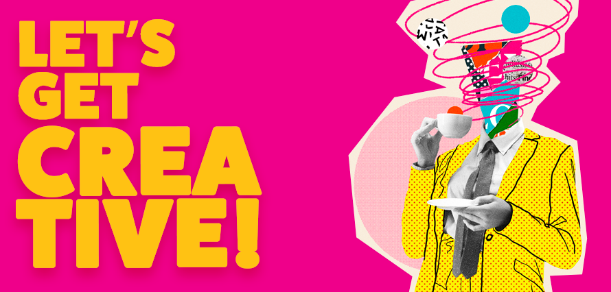
A few weeks ago we talked about the brand refresh, in which we touched on creative reasonings and processes. In this blog, I want us to delve a little deeper into designing with social media in mind. What it entails and how best to utilise smaller spaces when it comes to assets.
So the first question we’re going to tackle here is, WHY do we design for social media? Sure we could just post photos and videos without a thought and it’d do the job just fine? However…
Dimensions are important
Yes, they really are. Making sure your sizes are correct for specific platforms does matter. Instagram is most recognisable with its square format, landscape works best for LinkedIn, Facebook and Twitter – yet these all have specific dimensions to adhere to. You want all of your content to be visible, not cropped out due to the images being too wide or long.
The second question we need to ask ourselves is,
Does it make sense visually?
What I mean by this is, does the creative asset fit the brand? Is it confusing or does the message come through? Is there too much going on, or is there not enough?
All of these are questions that go through our minds when creating (so much so that they become second nature). We have to be mindful of the fact that people are endlessly scrolling. Poor design or bland design will go unnoticed.
Which leads me on to my next question,
How do we Break The Social Boring?
At IF we are always looking at ways to Break The Social Boring, taking a step back and looking at what’s working visually, making sure we’re being bold and standing out with our creatives without being obnoxious about it. We want to grab your attention in a way that makes you go “WOW”!
So, how the hell do we do this?
Pay attention to the brand, pay attention to what’s trending in design. Be inspired by other designers and make something unique from that. It’s okay to get a little silly with your work – sometimes it’s what you need to figure out how best to approach a brief.
In conclusion, dear designers, keep up to date with social media image and video sizes – these are super important. Make sure you aren’t cramming too much into the design – negative space *can* be a good thing. If you’re asking yourself “should I add that extra space cowboy in the background” the answer is most likely a “NO”. If there’s too much information, how best can we reduce that whilst still making it make sense? Carousels are a thing and they should be used to help make your designs flow and more engaging.
Have fun with what you’re doing, and most importantly, don’t be afraid to push your creative boundaries.