May 19, 2020
Now is a time of rapid change – which can be scary. People are inherently resistant to change because it means disruption, even if it is beneficial. Can you remember Instagram’s old logos? The days when it looked more like a rounded-edged floppy disk? When Instagram’s logo was updated in 2016 to the colourful design we have today, the change was met with the typical annoyed resistance – here are a few colourful examples. In hindsight, many would agree the new logo is better, and yet we have issues with it.
The same is true of feature updates in social media platforms, of which there have been a few in the last few weeks. Let’s take a look, but first:
Why redesign?
Core to a redesign is filling a need – often one people don’t know they have. It’s a risk, requires testing to make sure it works and can fall flat. Microsoft Office famously reinvents itself every few years, and where some iterations are met with praise, others are universally panned – leading plenty of people to write entire articles titled, ‘Why I hate Microsoft Office 2010’. It makes for pretty fun reading though; one line in particular is great fun: “don’t get me started on that abomination called Quick Steps, which is anything but quick to figure out or use effectively.”
Today, we have testing phases – especially for smaller updates like those found in our social media platforms. Mini-betas, if you will. You’ll know they are happening by the flurry of Tweets from people complaining about something having changed, or being asked to opt in to an update they don’t want, followed by testing, superiority over being chosen and finally either acceptance or rejection. Two updates have gone live recently, one on Twitter and the other on Facebook.
Embedding the future
Starting today, Twitter is launching a new version of embedding Tweets. Sporting an updated design and promising a better infrastructure, Twitter is hoping the version will help load Twitter faster on sites and apps. Of course, the update is only being rolled out, as this is still part of the testing process.
So, how different is it? Well, not very – take a look:
Before

After

It’s almost like a spot the difference puzzle. There is likely a lot going on behind the scenes, though, with changes that will make loading even faster. Twitter is already an incredibly data friendly social platform – anything that improves that can only be considered a plus. Still, this feels like a design change that nobody asked for and many won’t even notice.
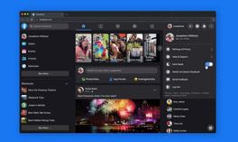
Facebook goes dark
In the case of Facebook, their recent redesign is one people have been clamouring for – and one I can see many people switching on forever. The overall look has changed, switching to a less cluttered interface, with brighter icons and, crucially, a dark mode. A small percentage of users have been trialling the new look earlier this year, but now everyone can use the more minimalist overhaul. The aim is to make it easier for users to find what they are looking for.
If you’re not anything like us, you’re used to being on Facebook into the small hours of the night. One thing that bothers many is the glaring white light that is impossible to switch off – until now. The dark-mode background minimises screen glare for use in low light, meaning you no longer have to feel like you are burning your retinas when browsing at night.
You can expect the new desktop look within the next couple of weeks.
For more on recent social media updates, check out our snapshot from last week, here!