June 23, 2025
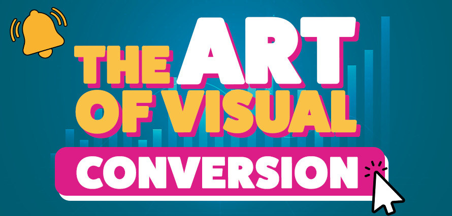
Designing Scroll-Stopping Social Media Visuals That Drive Newsletter Sign-Ups
Social media is noisy. On platforms like LinkedIn, Facebook, and Instagram, you’re not just competing with other brands, but you’re up against photos of someone’s wedding, a colleague’s promotion, and endless memes. If your post is asking people to take action, like signing up for your newsletter, you need to earn their attention first.
This is where visual design plays a crucial role. A well-crafted social media asset doesn’t just “look good”; it grabs attention, builds trust, and drives clicks. Let’s break down how to design scroll-stopping visuals that make people want to hit that subscribe button.
Starts with a Clear Message
Before opening your design software, ask: What’s the one reason someone should subscribe to this newsletter?
Whether it’s expert tips, exclusive offers, or insider content, your asset should clearly and immediately communicate this information. That message becomes your visual anchor for the bold headline, the hero image, or the callout text.
On LinkedIn, this could be a clean graphic with the words “Level Up Your Leadership – Weekly Insights by Email”, or on Instagram, it might be a punchy Story slide reading “Unlock Secret Deals – Subscribe Now” with a swipe-up or link in bio. The key is to say less, but mean more. Strip back the fluff and let the value lead.
Visual Hierarchy
People don’t read on social, they scan. So, your visual layout needs to tell them, instantly, what to look at first, second, and third. Use a strong visual hierarchy to guide the eye. Your main message, like “Free SEO Guide”, should dominate the space.
This means:
- Large, bold typography
- High contrast between text and background
- Plenty of negative space
Pair your headline with a supporting visual, like a mock-up of the guide or a visual that references someone reading it. This gives context and emotional appeal at a glance.
Contrast Is Your Best Friend
If your image blends into the feed, it’s gone. Scroll. Done.
So, to stand out, you can follow those tips:
- Use contrast, light text on dark backgrounds (or vice versa)
- Use vibrant colours that reflect your brand but break the monotony of the platform
- Use sharp, legible fonts (save the cursive and fine print for print design)
- Use animated assets, especially on Stories or Reels. A quick flash of motion, text that slides in, an arrow pulsing, a CTA bouncing, can catch the eye just long enough to hold attention.
Design for Mobile First, Always
Most people will see your asset on a phone. That means small screen, fast thumb. Avoid cramming too much into the design.
Make sure:
- Your headline is readable without zooming
- Buttons or CTAs are visually distinct
- Visual elements are spaced well and don’t feel “squashed”
Test your design by sending it to your phone. If you can’t read or understand it in two seconds, go back and simplify.
Make the CTA Visual
Many posts rely on the caption to carry the call to action, but not everyone reads it. Make sure your CTA is part of the visual itself. That could be a “Subscribe Now” button-style element on your static post, or “Swipe Up” text with an arrow in your Instagram Story. On Facebook, a clean graphic with a mock sign-up field (like name + email) can visually nudge people into taking the next step. Subtle graphic elements like arrows, borders, or underlines can also help guide the viewer’s eye to the CTA.
Every visual you post is part of a bigger journey: from awareness to interest, to conversion. Get in touch, together we can do more than “just design a post,” we can build a relationship with your audience, and strong visuals that can spark curiosity. A clear message can invite trust, and a confident call to action can turn that interest into a newsletter subscription. When you combine strong design with the right strategy, you’re not just chasing likes, you’re building a community that wants to stay connected.